
By Mike Smith
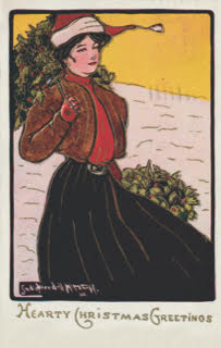
I had so much fun putting together the article on Sadie Wendell Mitchell postcards for the previous issue of the Wayback Times, I thought I’d poke around a bit and showcase some terrific cards by other female artists. Before I go much further though, I’d just like to report that I picked up another Sadie Wendell Mitchell card quite recently (see Figure 1). In this case, the card looks identical to a Mitchell gem already in my collection, but the caption is different. In other words, you’d have to collect two versions of this card to cover all the bases – one with “Christmas Greetings” and one with “Hearty Christmas Greetings.” It sounds nitpicky but we collectors are never happy until we have them all.
As mentioned in the previous article, Sadie Wendell Mitchell was the brother of prolific Toronto postcard publisher W. G. MacFarlane. In 1907, MacFarlane created seven excellent postcard series using his sister’s artwork, and didn’t stop there. That same year, he published some very collectible series by three other female artists. One was a five-card series called “Babies Habits” (see Figure 2). The artist here was American Ida Waugh (1846–1919), who was an important 19th century illustrator of children’s books and an award-winning painter. Both her parents and stepbrother were artists so she was tutored at home before continuing her training at the Pennsylvania Academy of Art and the Julian Academy in Paris. Waugh often collaborated with children’s book writer Amy Ella Blanchard, who became a lifelong friend and companion. The images shown on the postcards in the Babies Habits Series were first seen in a Waugh-Blanchard children’s book.

Another notable W. G. MacFarlane series by a female artist is one I had to record as “Flowers on a Silver Background” in my MacFarlane handbook because there was no series name on any of the cards. In addition, none of the cards had captions or numbers so cataloguing each one was quite a chore. On the plus side, the cards were reproductions of paintings by very talented German artist Catharina Klein (1861–1929). Presenting herself as Catherine Klein outside of Germany, for artist-signed postcard collectors this talented gal came along just at the right time. After finishing her studies at the School of Applied Arts in Berlin, she embarked on a career as an illustrator. Thanks to the advances in chromolithography (high quality colour printing) in the late 19th century, there was lots of postcard, calendar and magazine work in Germany for talented artists like Klein.

Catherine Klein’s artwork was very popular on both sides of the Atlantic during the postcard’s so-called golden age (1900–1914), and today her paintings and signed postcards are still in demand. Putting together a complete collection of her postcards would be tough though. According to one reference I checked online, about 2,300 of her images were reproduced by 75 different publishers!
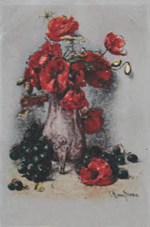
Clara von Sivers (1854–1924) was another German artist whose work was reproduced on a series of W. G. MacFarlane postcards. Because von Sivers painted many still life scenes with flowers and fruit, and they were reproduced on postcards with a silver background (see Figure 4), I initially confused her artwork with that of Catherine Klein’s. Once I took a good look at the signatures though, I was able to make the distinction. One thing I should note about Klein’s and von Sivers’ artwork is that none of their numerous still life paintings available for viewing online have a silver background. So it appears that this silver effect was added by the postcard printer. This, by the way, is one of the reasons why postcards of this type are often referred to as the “fancies” by collectors. And by all accounts, W. G. MacFarlane was the king of the fancies.

One of the most prolific female artists during the postcard’s golden age was American Katharine Gassaway. When I looked her up in J. L. Mashburn’s The Artist-Signed Postcard Price Guide, the listing of her output almost filled two pages. Although there were references to numerous American publishers in the listing, the Rotograph Co., New York seemed to be her publisher of choice. On this side of the border, her lengthiest and most recognizable series was published by postcard powerhouse Warwick Bros. & Rutter of Toronto (see Figure 5). Note that each of the cards in this Gassaway series has a number with an “F.L.” prefix, and all show children in comic situations. At more than 100 different cards, the series is definitely a challenge to collect, but certainly worthwhile.