

Mike Smith
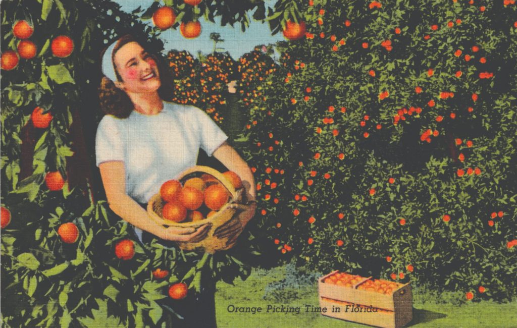
I was made aware of the collectability of the so-called “linen” postcard about 20 years ago at a Toronto Postcard Club (TPC) presentation given by collector Kyle Jolliffe. If Jolliffe’s goal was to interest other collectors in linen cards, he certainly succeeded with me. At that same presentation, he recommended a must-have handbook, Linen Postcards, Images of the American Dream by Mark Werther and Lorenzo Mott (2002). Needless to say, after purchasing a copy of this lavishly illustrated, all-colour publication from Amazon, I was hooked. A card from one of the impressive series in this document is shown as Figure 1.
So why did I ignore linen postcards until the TPC presentation? One of the reasons is that linens, as they are often referred to by collectors, weren’t around during the postcard’s classic era (1895–1919), which is the period I usually focus on. Another reason is that the vast majority of the linens available in the hobby today have American themes, so I tended to overlook them. Now there’s a good reason for the American bias. Namely, the world’s largest producer of linens was Curt Teich of Chicago, who introduced this innovative product in 1931. Teich’s linen postcards were made on high-speed presses using vibrant inks, a five-colour printing process, and a high rag-content paper stock. The rough texture on the surface of the cards had a linen-like feel, hence the name. The surface roughness was more than just a cosmetic feature of the cards however. It was actually developed by Teich to speed up the ink-drying process. This was an important consideration when using high speed presses.
With airbrushing, and extensive retouching and colourizing, Teich was able to convert black and white photographs of main streets, storefronts, fairgrounds, hotels, etc. into little cardboard masterpieces. Teich’s artists and illustrators also created cartoon linens, the popular large-letter linens, advertising linens and numerous other varieties.
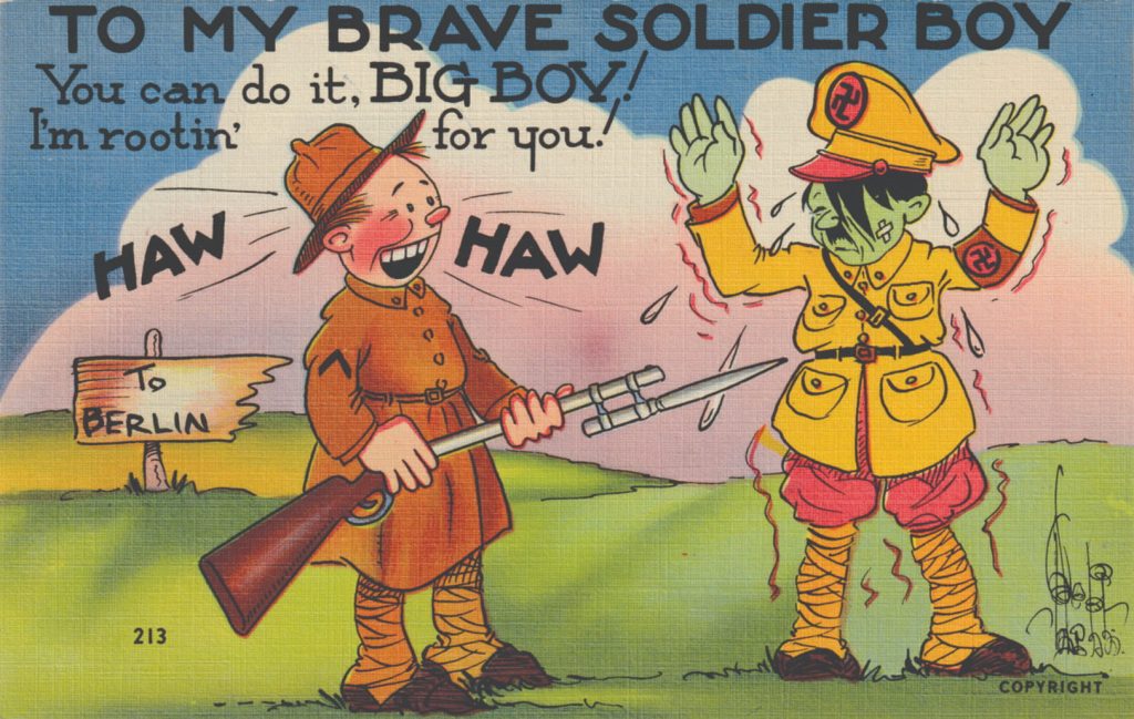
There were two major linen postcard makers in Massachusetts that provided Curt Teich with some serious competition – Tichnor Bros. Inc. of Boston, and Colourpicture Publishers Inc. of Cambridge. Like Teich, these firms used a five-colour printing process and a textured paper the same as or similar to that used by Teich. And also, like Teich, Tichnor Bros. and Colourpicture Publishers produced some very collectible anti-Hitler and anti-Japanese propaganda postcards during the Second World War (1939–1945). Interestingly, although both the Japanese leadership and the Japanese people were fair game on these cards, American propaganda against Germany was aimed almost exclusively at Hitler (see Figure 2) and not the German people. The large German population in the US at the time may have been a factor here.
On this side of the border, the Coast Publishing Co. of Vancouver, Valentine Edy Co. of Winnipeg, Royal Specialty Sales and Valentine Black Co. (see Figure 3) of Toronto were just some of the publishers distributing linen postcards in Canada. Note that Valentine Edy and Valentine Black were Canadian-owned offspring of the iconic Valentine & Sons of Dundee, Scotland. After producing some of the most collectible Canadian postcards in the hobby during the postcard’s golden age (1900–1914), Valentine & Sons sold off its Canadian operations to local managers after the First World War (1914–1918). Thus, Valentine Edy and Valentine Black emerged in the 1920s.
I deliberately used the term “distributing” with respect to Canadian publishers in the previous paragraph because not all the linens sold under these publishers’ names were printed in Canada. For example, when you check the back of the first batches of Valentine Black postcards issued in the early 1920s, they all say “Printed in U.S.A.” This, by the way, continued with Valentine Blacks’ linens. On the back of the Royal Specialty Sales’ linens, I’ve seen it either says “A Colourpicture Publication, Boston 15, Mass., USA” (see Figure 4) or “A Colourpicture Publication, Made in Canada.” So, it looks like Royal Specialty Sales initially ordered Canadian-themed linens directly from Colourpicture Publishers in Massachusetts, and later started printing them in Canada, probably under license.
Regardless of where any linen postcard was printed, this new card type with its durable stock, rough finish and bold colours helped rejuvenate the hobby in the 30s, 40s and 50s. And for today’s collector, there’s an astounding array of wonderful linens out there to discover.